For years, my company has had Philips as a customer. So when I decided to buy a large 42" television, 27 months ago, I bought a 42" Philips LCD TV, model PFL7662D/12. Wonderful thing.
Philips migrated away to Microsoft, and so I lost them as my customer. Guess what happened to my TV this week: it still produces sound, but no picture. The screen turned black :(
A search on the web shows I am not the only one. From all over the world I found posts from people who had the exact same problem with Philips TV's. So it looks as if Philips didn't make just one mistake (migrating away from Domino), apparently they also have big problems with their flat panel displays...
Here's a link to professionals discussing the problem. (This link is in dutch unfortunately) http://www.circuitsonline.net/forum/view/77417
http://www.consumeraffairs.com/home_electronics/philips.html
http://www.boards.ie/vbulletin/showthread.php?t=2055883560&page=2
http://www.trosradar.nl/zoeken/
Friday, May 28, 2010
Tuesday, May 18, 2010
From the series on Killer Apps: Email Archiving
Last week I had mentioned Rightfax as one of the common resource killers that we often see in larger Domino environments. Today, I want to show you another common killer application: email archiving. While I was writing this post, I seriously think I should dedicate a series of articles on what we internally refer to as Killer Apps. (Hence the title.)
During a recent assignment we noticed patterns in end user demand that showed a strong deviation from what we normally see. For us this usually is a reason to dive in a little deeper, to see what's going on. Let me show -and explain- you what we reported to our customer.
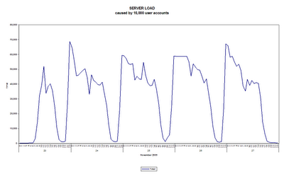
The case involves a government organization in the UK of almost 15,000 Lotus Notes users. Plotting the server load caused by end users over time (expressed in database Transactions per Minute - TPM), showed a pattern as follows:
If this is the first time you are looking at an analysis result like this, I can imagine that you do not notice anything strange at first hand. We see 5 working days (and each of the 7,220 minutes) in a week of November 2009, with load levels expressed vertically.
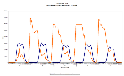
Watch what happens if we split the levels into two categories: one caused by 'normal' user accounts and the other caused by -what we refer to as- a heavy user account:
The blue line represents a typical load pattern one might expect from normal end user behavior. Almost 15,000 people who are coming into the office at 8-9am. have lunch at about 12 and go back home for dinner (or other activities) at about 17-18pm. Notice how the purple line shows demand levels that exceed those caused by the 15,000 end users by more than 150%. The purple line is in fact a single user account that carries the name emailxtender, which -according to their website- has been renamed into EMC SourceOne.
Interesting enough, a deeper dive into this SourceOne solution on the EMC website gave me access to their 'Benefits Calculator'. I could not resist registering and trying out their Benefits Calculator with the statistics we have for our customer. I'll spare you the details (shown in their report here), except for the fact that it claims to save this organization "$2,871,400 in total saving over the next three years".
I cannot match these claimed savings, with the massive amount of server resources that this emailXtender functionality is consuming at our customer environment. My customer would benefit more from switching it off, completely. Or contact EMC support...
Tuesday, May 11, 2010
To Cloud or not to Cloud
Last week we were working on a customer that had asked us to analyze their potential to migrate towards the cloud, Lotus Live in particular.
One of the key things was to analyze the behavior of business users. In particular companies need to know who is using just email and who's using applications. Secondly, companies want to understand who is using which type of client to access the email and applications.
With DNA we performed our analysis, and using Tableau Software, we created a dashboard. I think it looks great (my colleague Erik has a great talent for visualization):
Killer Apps or Killer Fax?
With DNA, we have analyzed hundreds of millions of user activities in IBM Lotus Notes & Domino in many large organizations worldwide. Typically, our customers have somewhere between 1,000 and 100,000 end users.
Often we notice how only a few user accounts (less than 5) consume the majority of all costly resources available in a Domino environment. I'm talking about network capacity, server capacity and disk IO.
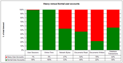
The chart below shows the situation at a car manufacturing company in the USA. Of the 10,000+ user accounts, a single account is responsible for 44 - 78% of the total demand generated by those 10,000+ users.
This single 'heavy' account is a fax solution named RightFax, previously owned by a company named Captaris. In their support guide, a polling intervals of 60 seconds is being recommend. Over a 7 day period, this had led to a network consumption of 1,097,469,772,731 bytes ( > 1 terabyte), 27 million document reads, 14 million document writes and an amazing 130 million database transactions.
This fax solution consumes more resources than all 10,000 corporate users did together. We see similar behavior at other customers who have this fax solution implemented.
What can you do about this? First, I would recommend to immediately reduce its polling intervals to e.g. 60 minutes. Next, I would see how many faxes this solution has actually processed during that week. Fair chance the outcome is zero or very few. If not, check with your customer if they are willing to pay 50% of your total cost / TCO. Fair chance they won't.
Let me know if you have this solution in your environment. If so, do yourself a favor and check how much capacity your solution is consuming. Your comments are more than welcome!
Monday, May 10, 2010
Mail Routing Analysis
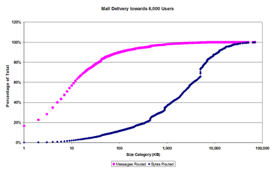
Ever wondered how big (or small) emails are within a typical government organization?
Look at this:
The horizontal axis shows the size of emails, in 1KB increments. The vertical axis represent the percentage of the totals, cumulative in each of the size categories.
So messages up to 10KB in size represent 60% of all emails delivered, but only 1% in terms of total volume in bytes.
Whats the point? Well, imagine you give your users instant messaging (IBM Lotus Sametime for instance). Fair chance that the load on the server for mail routing will drop with 60%.
Thursday, May 6, 2010
How to change the data source in a workbook within Tableau Software
In the tableau forum I was trying to find a solution for making Tableau workbooks point to a different data source without having to create all the sheets. Without success, so I started hacking myself. With success.
Here's how you can do it.
First, make sure you have a good editor, such as notepad++.
Now open the workbook with your editor. It's an XML file, so in notepad++ you want to select Language, XML to view the file in that language.
Collapsing all root elements should give you a view that looks like this:
Notice how the basic structure consists of Preferences, Data Sources, Worksheets, WIndows and Thumbnails. (my workbook did not have a Dashboard yet, otherwise you should have seen that too).
If you expand the DataSources element, you'll see an element for each data source:
My workbooks has 7 data sources that all connect to a PostgreSQL backend.
Let's take a look at the first data source named 'namelookup_cachepool'.
If you expand the element you will see an element named .
Here's how mine was specified (I had to remove the '<' and '>'symbols to make it display on my blog):
' connection class='postgres' dbname='d2dna' port='5432' server='d2host' username=''
' relation name='TableauSQL' type='text'select server, ts, value from ibmsur0001_dwh.statrep_entry
' /connection
Basically, this data source has two dimensions (servers and ts), and measures stored in a column named 'value'.
I created a Tableau Extract file from my data source to Postgres, and created a new workbook that now connects to this extract file. The connection element in the workbook file now looks different from my first example:
' datasource inline='true' name='NAMELOOKUPCACHEPOOL Extract' version='7.7'
' connection class='firebird' dbname='C:\Documents and Settings\wouter\My Documents\My Tableau Repository\Datasources\NAMELOOKUPCACHEPOOL.TDE' tablename='TableauExtract' username='SYSDBA'
' relation join='inner' type='join'
' clause type='join'
' expression op='='
' expression op='[TableauExtract].[fk:ts:0]'
' /expression
' expression op='[ts].[pk:ts:0]'
' /expression
' /expression
' /clause
' relation join='inner' type='join'
' clause type='join'
' expression op='='
' expression op='[TableauExtract].[fk:server:0]'
' /expression
' expression op='[server].[pk:server:0]'
' /expression
' /expression
' /clause
' relation name='TableauExtract' table='[TableauExtract]' type='table' /
' relation name='server' table='[server]' type='table' /
' /relation
' relation name='ts' table='[ts]' type='table' /
' /relation
' calculations
' calculation column='[Number of Records]' formula='1' /
' /calculations
' /connection
Notice how the two dimensions (server and ts) are defined.
I did some testing by replacing everything in the element. It seems to work, as long as you make it point to data of the exact same format in terms of columns and data types.
Over the next couple of days, I will be posting more on this topic.
Here's how you can do it.
First, make sure you have a good editor, such as notepad++.
Now open the workbook with your editor. It's an XML file, so in notepad++ you want to select Language, XML to view the file in that language.
Collapsing all root elements should give you a view that looks like this:
Notice how the basic structure consists of Preferences, Data Sources, Worksheets, WIndows and Thumbnails. (my workbook did not have a Dashboard yet, otherwise you should have seen that too).
If you expand the DataSources element, you'll see an element for each data source:
My workbooks has 7 data sources that all connect to a PostgreSQL backend.
Let's take a look at the first data source named 'namelookup_cachepool'.
If you expand the element
Here's how mine was specified (I had to remove the '<' and '>'symbols to make it display on my blog):
' relation name='TableauSQL' type='text'select server, ts, value from ibmsur0001_dwh.statrep_entry
' /connection
Basically, this data source has two dimensions (servers and ts), and measures stored in a column named 'value'.
I created a Tableau Extract file from my data source to Postgres, and created a new workbook that now connects to this extract file. The connection element in the workbook file now looks different from my first example:
' datasource inline='true' name='NAMELOOKUPCACHEPOOL Extract' version='7.7'
' connection class='firebird' dbname='C:\Documents and Settings\wouter\My Documents\My Tableau Repository\Datasources\NAMELOOKUPCACHEPOOL.TDE' tablename='TableauExtract' username='SYSDBA'
' relation join='inner' type='join'
' clause type='join'
' expression op='='
' expression op='[TableauExtract].[fk:ts:0]'
' /expression
' expression op='[ts].[pk:ts:0]'
' /expression
' /expression
' /clause
' relation join='inner' type='join'
' clause type='join'
' expression op='='
' expression op='[TableauExtract].[fk:server:0]'
' /expression
' expression op='[server].[pk:server:0]'
' /expression
' /expression
' /clause
' relation name='TableauExtract' table='[TableauExtract]' type='table' /
' relation name='server' table='[server]' type='table' /
' /relation
' relation name='ts' table='[ts]' type='table' /
' /relation
' calculations
' calculation column='[Number of Records]' formula='1' /
' /calculations
' /connection
I did some testing by replacing everything in the
Over the next couple of days, I will be posting more on this topic.
Wednesday, May 5, 2010
DNA Analytics with Tableau Software
Over the past weeks, I've been testing Tableau Software to see how this could contribute to our DNA Network Analysis services. I am impressed.
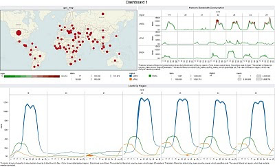
Just to give you an example. let me show you an example of how a large organization is using IBM Lotus Domino:
The map on the left upper side of the dashboard shows where this customer has office locations in the world. The right side shows how network bandwidth is being consumed in each region of the world (apac, emea, amec). The graph below shows session concurrency is each region.
When I click on an office (or select a number of offices on the map), the two charts automatically reflect the selection I made. Cool!
Thanks to Mike Dudding (IBM) who pointed me to this software. I will be posting more on this soon...
Subscribe to:
Posts (Atom)
