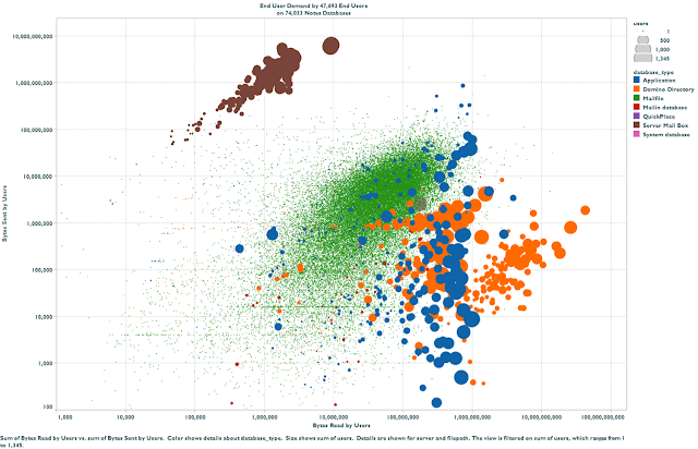
The absolute favorite of all DNA customers, this scatter plot that shows how 47,693 end users were using 74,033 Lotus Notes databases.
Every bubble is a database. Bubbles have colors, indicating the type of database. Bubbles have different diameters, indicating the distance number of users that showed activity on each database. (mail files tend to have only one user, hence the many small green bubbles). The horizontal and vertical axis represent network IO, caused by 7 days of activity from users on these databases. Both axes are logarithmic, so every gridline is a 10-fold increment in demand.
What make this particular case so interesting is the fact that most network load is caused by users connecting to Directory databases (names.nsf and directory catalogs). Deeper analysis revealed a misconfigured directory catalog, causing end users to replicate too many documents.
Tableau Software (desktop, version 7) was used to produce this visualization. Too bad they don't have a version for the Mac.

