Tuesday, December 8, 2020

Meta-data Analysis at eurosurveillance.org

Background

The goal is to understand how much time it typically takes for Research papers to get reviewed and accepted by eurosurveillance.org.

The reason for this assessment is to provide clarity around discussions of a specific research paper that was reviewed and accepted in a single day. Some scientists think it is impossible to Peer-Review research within a single day. Other scientists claim the paper went thru -the much quicker- Rapid Review procedure, as outlined on the journal's web site. 

To assess commonality in the review and acceptance process at eurosurveillance.org, the author collected and analysed meta-data for all 1,595 publications since 01-Jan-2015. Earlier this week, the author shared the initial findings of this assessment in a Twitter post. 

This six-page document aims to make these findings reproducible and verifiable by offering step by step instructions.

Summary of Findings

  • Of the 17 types of articles published since 2015, three types occur most frequently: Rapid Communication (385), Research (312) and Surveillance (193).
  • The average number of days between Acceptance and Reception of Research type articles is 172 (2019) and 97 (2020). 
  • In line with the Editorial Policy for Authors, the category 'Rapid Communication' publications appear to be reviewed and accepted more quickly (18 days average) than type 'Research' and 'Surveillance.'
  • Except for this one Research article (on 22-jan-2020), no other article has ever been reviewed and accepted within a single day since 2015.
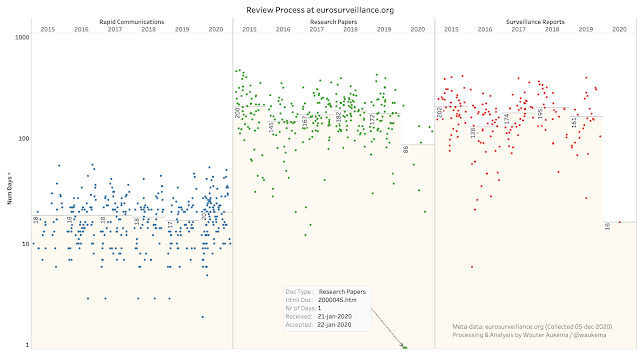
Picture that places the discussed Research Paper into context

For a Fully Interactive Dashboard, position. your browser in landscape and click here.

About the Author

Wouter Aukema has over 30 years of experience in processing data and analysing behaviour of organisations and systems for governments and corporations world-wide and develops analysis solutions for Fortune 100 companies. His publication at Defcon (20 years ago) caused headlines world wide. Wouter sees data and patterns where others don’t.

Download the Report

A PDF version of the report -with step by step instructions- can be downloaded here.

Thursday, March 12, 2020

Corona Pandemanic: Gentle Surgeons Make Stinky Wounds

Countries take different measures when it comes to the Corona Pandemanic and I was wondering if this could be visualized by the data published by John Hopkins University (JHU) on GitHub.

Here's my attempt:


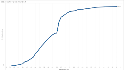
What I produced is how various countries came to their 'score' of infections. Vertical axis: Percentage of total confirmed infections on March 11, 2020. Horizontal: Days, past 14 out of 49 total days since news came out. I picked a few countries from Asia, Europe and the USA with significant number of infections. The underlaying dashboard is available on my Tableau Public repository.

To my limited understanding, we are aiming for the top in a Bell-curve. This would mean that China reached their top already (see graph below for their full date-range) and that Singapore and South Korea are getting close to their tops.

If we look at USA, Netherlands, Germany etc. we are still climbing up the curve. Steeply. USA is climbing even more rapidly than we are here in The Netherlands.

In Dutch, we have a saying: "gentle surgeons make stinky wounds".

Confirmed cases in China:

Thursday, February 20, 2020

NOx Emissie door Industrie: Dit zijn ze.

In het rapport van het Adviescollege Stikstofproblematiek werd gemeld dat de NEC-sector Industrie 50,7 kiloton NOx had uitgestoten in 2017.

Hieronder staan al die bedrijven, in een interactieve dashboard. (klik op de picture.)
Overigens mooi om te zien dat de cijfers goed in de buurt komen van het rapport.

De gegevens zijn afkomstig van: http://www.emissieregistratie.nl/erpubliek/erpub/facility.aspx. Hierbij heb ik alle bedrijven geselecteerd waarvan cijfers over 2017 werden vermeld.


Monday, February 17, 2020

Convert Dutch RD coordinates to WGS-84

Some weeks ago, I found this great Tableau formula by Rik van Schaik to convert x,y co-ordinates from the Dutch Rijksdriehoek system to latitude, longitude.

Works great in PostgreSQL to:

 -- Based on a Tableau calculated field formula by Rik Van Schaik
 -- Added more decimals for precision
 -- Rewritten for PostgresSQL
 -- Replace x & y by field names of your choice
 -- feb-2020 aukema.org

select
 52.15517440 + ((
 (3235.65389 * ((y - 463000) * 10 ^ -5)) + 
 (-32.58297 * ((x - 155000) * 10 ^ -5) ^ 2) + 
 (-0.2475 * ((y - 463000) * 10 ^ -5) ^ 2) + 
 (-0.84978 * ((x - 155000) * 10 ^ -5) ^ 2 * ((y - 463000) * 10 ^ -5)) + 
 (-0.0655 * ((y - 463000) * 10 ^ -5) ^ 3) + 
 (-0.01709 * ((x - 155000) * 10 ^ -5) ^ 2 * ((y - 463000) * 10 ^ -5) ^ 2) + 
 (-0.00738 * ((x - 155000) * 10 ^ -5)) + 
 (0.0053 * ((x - 155000) * 10 ^ -5) ^ 4) + 
 (-0.00039 * ((x - 155000) * 10 ^ -5) ^ 2 * ((y - 463000) * 10 ^ -5) ^ 3) + 
 (0.00033 * ((x - 155000) * 10 ^ -5) ^ 4 * ((y - 463000) * 10 ^ -5)) + 
 (-0.00012 * ((x - 155000) * 10 ^ -5) * ((y - 463000) * 10 ^ -5))
 ) / 3600) as lat,

 5.38720621 + (( 
 (5260.52916 * ((x - 155000) * 10 ^ -5)) + 
 (105.94684 * ((x - 155000) * 10 ^ -5) * ((y - 463000) * 10 ^ -5)) + 
 (2.45656 * ((x - 155000) * 10 ^ -5) * ((y - 463000) * 10 ^ -5) ^ 2) + 
 (-0.81885 * ((x - 155000) * 10 ^ -5) ^ 3) + 
 (0.05594 * ((x - 155000) * 10 ^ -5) * ((y - 463000) * 10 ^ -5) ^ 3) + 
 (-0.05607 * ((x - 155000) * 10 ^ -5) ^ 3 * ((y - 463000) * 10 ^ -5)) + 
 (0.01199 * ((y - 463000) * 10 ^ -5)) + 
 (-0.00256 * ((x - 155000) * 10 ^ -5) ^ 3 * ((y - 463000) * 10 ^ -5) ^ 2) + 
 (0.00128 * ((x - 155000) * 10 ^ -5) * ((y - 463000) * 10 ^ -5) ^ 4) + 
 (0.00022 * ((y - 463000) * 10 ^ -5) ^ 2) + 
 (-0.00022 * ((x - 155000) * 10 ^ -5) ^ 2) + 
 (0.00026 * ((x - 155000) * 10 ^ -5) ^ 5)
 ) / 3600) as lon

Friday, January 31, 2020

Stikstof: Nederland aan Top? Of toch Niet?

Vaak lees ik hoe wij in Nederland de hoogste stikstof emissie per vierkante kilometer scoren.

Nederland is het slechtste jongetje van de EU klas.

Maar wat als we nu eens hetzelfde rekensommetje maken, maar dan gerelateerd aan het aantal inwoners?

Nederland is slechts een gemiddelde leerling, zie maar:


Data is afkomstig van het Centre on Emission Inventories and Projections die hun gegevens op zeer transparantie wijze beschikbaar stellen (middels Tableau dashboards, die je kunt downloaden).

Monday, January 20, 2020

RIVM NOx Bubbles

Ruim 8.500 mensen hebben mbv. deze interactieve NH3 kaart gekeken in hoeverre de model-data van het RIVM strookt met hun eigen beleving.

Vandaag een nieuwe dashboard: NOx Bubbles. Met de NOx component uit de bron-data waarmee het RIVM hun modellen berekent. Deze nieuwe dashboard ziet er anders uit dan de vorige, omdat we met hulp van o.a. Geesje Rotgers de data veel meer betekenis konden geven.

Nieuwe functies

Bij elk data-punt op de kaart, kun je de Google satelliet view erbij pakken. Ook kun je vanaf ieder data-punt je melding doen bij Evert Mouw, als jou iets opvalt.

    Observaties

    Ik weet niet in hoeverre deze data-set als 100% volledig en absoluut betrouwbaar moet worden beschouwd. Wel meen ik te zien dat in de data-set gegevens lijken te ontbreken. Zo zie ik geen gegevens mbt. de NOx uitstoot door auto-bussen of militaire en civiele schiet-banen.

    Ook zie ik een significant aantal data-punten in de RIVM data-set gemarkeerd staan als snelweg, terwijl hiervan -volgens mijn eigen inschatting en die van Rijkswaterstaat- geen sprake kan zijn.

    NOx waarden in de RIVM data-set zijn grammen per seconde en gaan tot zes decimalen. Voor de leesbaarheid heb ik in het opening-scherm deze omgerekend (q(g/s) x 3600 x 24 x 365 / 10^6) ofwel kiloton per jaar x 1.000.

    Mbt. de kolommen hc(MW) en h(m) hebben we in dit dashboard niets gedaan. De waarden zitten wel in het model zelf.

    Samenwerking en verantwoording

    Data is afkomstig van het RIVM. Evert Mouw, die er een eerste blik op wierp, heeft de RD coordinaten naar WGS omgezet.  Anna van Ee heeft een Functional Mobile Usability Test verricht waardoor we de meeste issues eruit konden halen.

    Handleiding voor mensen met geduld


    Let op: Alles kan wat traag overkomen. 730K+ pixels op een smartphone is best pittig

    De NOx Bubble opent met acht categorieën. Klik op een categorie om de kaart te openen met focus op die categorie. De kaart opent met de waarden geplot op alle GPS-coördinaten.

    Elk datapunt kun je aanklikken en biedt extra functies (zie hierboven).
    Onder de kaart kun je filteren op sub-categorie. Let op: Reset dit filter voordat je andere categorie kiest.

    Klik op de Bubbles om te openen >>

    Friday, January 17, 2020

    RIVM NH3 Administratie op Straat

    Hoeveel uitstoot van ammoniak is er in jouw buurt of straat?

    Op deze interactieve kaart, kun je kijken of de perceptie van het RIVM overeenkomt met jouw eigen beleving.


    Deze dashboard kun je het beste met een tablet of desktop pc openen. Met je smartphone werkt het ook. Snelheid kan wat traag overkomen. Dit zijn namelijk ruim 730,000 datapunten.

    Over de data-sets

    Afgelopen 07-jan-2020 gaf het RIVM twee setjes data met 730K rijen vrij. Eén over NH3 en eentje over NOx. Helaas zonder enige documentatie. Om de kolomwaarden in de data te begrijpen, heb ik van het RIVM deze spreadsheet achterhaald.

    Observaties mbt de NH3 data-set

    Men heeft bewust de macro’s (programma code) uit de spreadsheet verwijderd. Zelf zou ik dat alleen doen, als ik zou willen dat niemand kan begrijpen hoe ik de gegevens manipuleer.

    De data-set vertoont wel erg veel overeenkomsten met de input die door gemeente-ambtenaren mbv deze spreadsheet kennelijk worden ingeklopt.

    Samenwerking en verantwoording

    Data is afkomstig van het RIVM. Evert Mouw, die er een eerste blik op wierp, heeft de RD coordinaten naar WGS omgezet. Anna van Ee gaf veel goede tips en heeft het stikstof-verhaal zeer goed in beeld. Dit is een spontane team effort, als gevolg van de ‘FDF Klets’ groep in Telegram. Tijdens een video-call met Rutger van den Noort en Robert Bor, die kennelijk al eerder aan RIVM vragen stelden, kreeg ik er vertrouwen in om dit te publiceren.

    Vervolg stappen


    • Volgende visualisatie voor NOx data (dit weekend)
    • Calibratie RIVM data met US EPA (Amerikaanse Environment Protection Agency) alsmede US Department of Agriculture.
    • Universiteit van Amsterdam (UVA) gaat aan de slag. Ik hoop echt dat het UVA met resultaten kan komen voordat de politiek nog meer Management by Surprise gaat praktiseren. Zie deze link
    • Evert Mouw gaat proberen de data nog verder te verrijken richting bv. GPX.