Countries take different measures when it comes to the Corona Pandemanic and I was wondering if this could be visualized by the data published by John Hopkins University (JHU) on GitHub.
Here's my attempt:
What I produced is how various countries came to their 'score' of infections. Vertical axis: Percentage of total confirmed infections on March 11, 2020. Horizontal: Days, past 14 out of 49 total days since news came out. I picked a few countries from Asia, Europe and the USA with significant number of infections. The underlaying dashboard is available on my Tableau Public repository.
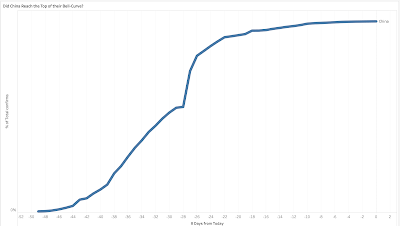
To my limited understanding, we are aiming for the top in a Bell-curve. This would mean that China reached their top already (see graph below for their full date-range) and that Singapore and South Korea are getting close to their tops.
If we look at USA, Netherlands, Germany etc. we are still climbing up the curve. Steeply. USA is climbing even more rapidly than we are here in The Netherlands.
In Dutch, we have a saying: "gentle surgeons make stinky wounds".
Confirmed cases in China:

